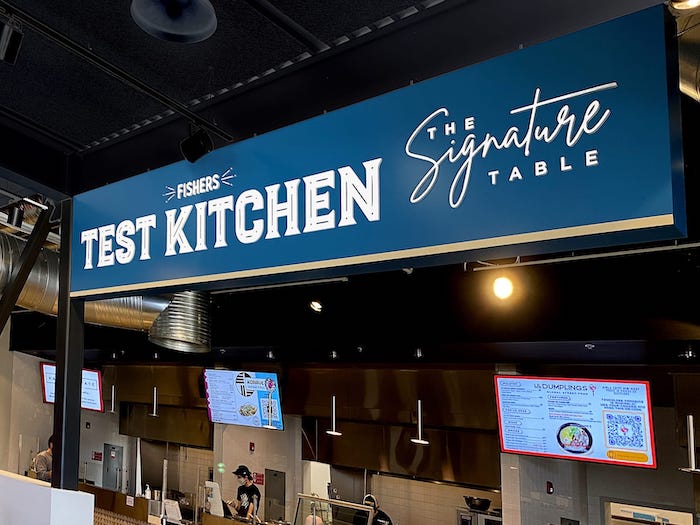
Do you remember the days of writing assignments in elementary school, middle school, or high school? While they typically weren’t the most fun aspect of your school days, there was one element that made them appealing: Choosing your font. There were always so many to choose from, even back in the ‘90s, that picking just one often seemed impossible!
Today, there’s a lot more at stake than a good grade on a report. Choosing the right font for your sign can make all the difference when it comes to its readability and how people may remember it. You want them to remember your sign for all the right reasons— and it all starts with its font.
This article explores the best fonts for signs that ensure people can read them easily. For personalized advice, contact our team at Signworks today.
First Impressions Count
More than just text on a surface, your sign— and its words, message, and font— is usually the first interaction people have with your brand. As such, choosing the right font for your sign plays a large role in ensuring your message gets across clearly and effectively.
Whether it’s a wayfinding sign, a monumental sign, or a freeway billboard, your font can make or break your message. It’s one of the first things somebody will notice when they see your sign, so make sure it stands out in the way you want it to!
What’s in a Font?
One of the first things to think about when choosing a font for your sign is whether you want a serif or sans serif font. Even if you’re unfamiliar with the terms ‘serif’ and ‘sans serif’, you can probably tell the difference once you know what it is!
Serif Fonts
Serif fonts have small lines or strokes at the ends of the letters, sometimes referred to as each letter’s ‘feet’. These fonts are designed to guide the reader’s eye from one letter to the next, making it easier to read when there’s a lot of text.
You’ll often see serif fonts in books, magazines, and on web pages. Although it’s not a ‘rule’ as such, serif fonts tend to be seen as more formal and traditional. And because they’re typically used for longer blocks of text, they’re not often used for signs.
Sans Serif Fonts
‘Sans’, meaning ‘without’, means that sans serif fonts don’t have the little lines, strokes, or feet at the ends of the letters. This makes them appear more simple and clean, often making them easier to read. Their pared-back appearance also makes them look more modern, as opposed to serif font’s traditional style.
As sand serif fonts are usually easier to read than their serif counterparts, they’re also easier to read from distances. This makes them ideal for shorter messages, headlines, and signs. Where quick readability is key, sans serif fonts shine.
The Best Fonts for Signs
With thousands of fonts out there, it may feel overwhelming to choose the right one. While it’s completely up to you, there are a few tried-and-true fonts that are known for their easy readability and effectiveness. Some of these are:
1. Helvetica
This classic font is clean, balanced, and easy to read. Whether your sign is indoors or outdoors, Helvetica’s simple lines make it a versatile option that works well for just about any setting.
2. Gotham
If you’re looking for something bold and modern, Gotham is a great choice. This sans serif font is known for its geometric design, making it incredibly easy to read, even from a distance.
3. Futura
Futura’s shapes and clean lines give it a modern, minimalistic feel that’s perfect for signage. It’s versatile enough to work for both small and large signs, and pairs well with a variety of design styles.
4. Franklin Gothic
Franklin Gothic is all about making a big impact. Its bold, powerful design makes it a favorite for headlines and large signs. Plus, its narrow width means you can fit more text on your sign without sacrificing readability.
5. Arial
Arial is a go-to, no-nonsense font that’s highly legible, so you can trust that it will work well for a variety of signs. Whether it’s an informational display or wayfinding signage, you can’t go wrong with this classic.
6. Garamond
Garamond offers a touch of sophistication, combining elegance with readability. It’s especially effective for signs that need to convey a sense of tradition, and its light strokes make it easy to read, even in smaller sizes.
7. Montserrat
Montserrat is a modern, geometric sans serif font that’s perfect for portraying a sleek and stylish look. It’s easy to read and works well for both small and large signs, making it both fashionable and functional.
Find Your New Favorite Font with Signworks
Choosing the right font for your sign is about more than just picking one that looks good— it’s about making sure your message is clear and readable. At Signworks, we can help you pick the right font for your sign and ensure it matches your branding while conveying your message effectively. Wondering how we do it? Find out by contacting us today!

