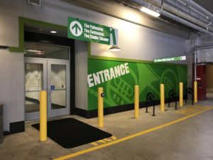
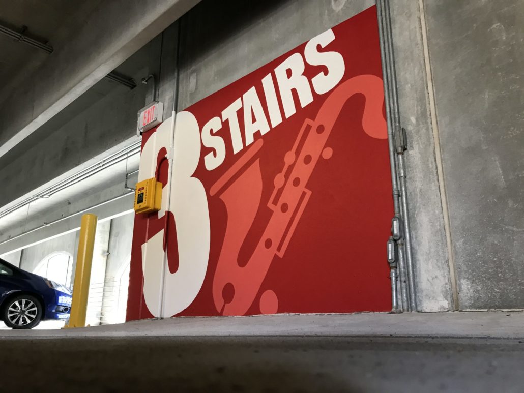
Maybe not all who wander are lost, but that intern on their first day of work, wandering the halls in search of the coffeemaker definitely is. Businesses, both large and small should make sure everyone is able to easily navigate their location. Wayfinding is vital to helping the observer perceive and mentally organize the environment. Quality wayfinding improves your visitors’ experience, safety, and productivity. Give your traffic flow a boost by improving the wayfinding in your space through engaging wayfinding. Here are a few tactics you may use to engage your visitors with your wayfinding signage.
Gamify your Wayfinding.


Colors trigger the sensory receptors in our brains resulting in our ability to 
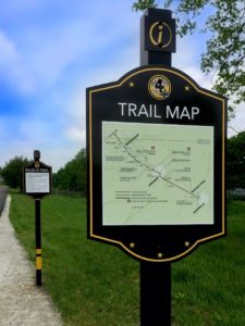
Use Maps in your Wayfinding.
Every explorer needs a map. Visitors to your location can venture out on their own self-guided tours by following the directions shown on the strategically placed maps in and around your facility. Strategic locations are any points where a person may decide between paths to take. Entrances, hallway intersections, bathrooms, elevators and stairs are examples of places of decision. For the best results, follow these basic tenets for your maps:
- Make it intuitive
If your maps use clear language and are consistent with symbols, your visitors will not have to decipher the map’s meaning. - Make it relevant
Only give information that is relevant and specific to the space and path. - Brand outside the lines
Provide a clear visual by keeping your branding out of the way of navigation information.
Wayfinding signage can transform new employees and visitors into experts at navigating your space. Help wandering lost souls to find their way (not to mention the coffeemaker) by strategically positioning engaging signage that improves the overall experience of a visit to your location.

